Ocado Group Baseline
A comprehensive refresh and refinement of the Ocado brand, designed with a tech-first approach to create a modern look and voice that effectively communicates with both prospective and current employees.
-
With no pre-existing brand identity in place, Ocado Group found itself carrying forward the visual design legacy from its Ocado retail era—however, after entering into a joint venture with M&S, there was a new need to establish a distinct position and strategy in the tech space.
-
The objective was to develop a people-centric brand identity that would effectively communicate with both current employees and prospective talent; to create a compelling and authentic design language that would drive user engagement and garner positive feedback across various platforms and mediums.
The steer we received from stakeholders was to rely heavily on the original ‘Ocado’ wordmark but the the swirl needed to be dropped, which meant a completely new brand identity system was needed, to help enable positive employee experience and also improve recruitment.
-
To move away from the retail visual identity, we implemented a grid system that would be the framework for all the visual elements and typography – reflecting the core of the Ocado Smart Platform.
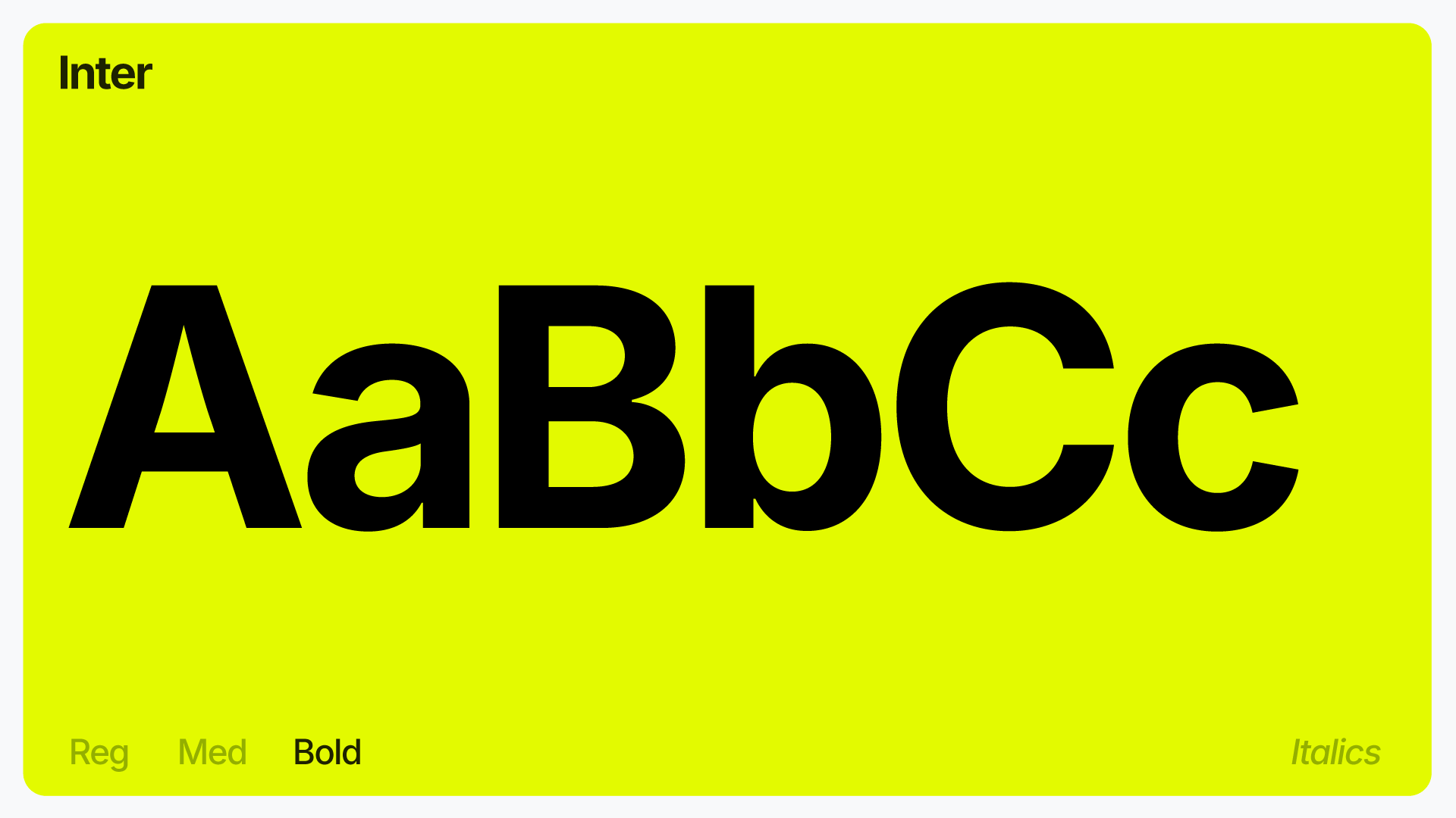
With the inclusion of a grid system, we broke away from the typeface Ocado.com was using and implemented a versatile and useable typeface, Inter gave it a tech feel, but with the durability and flexibility around weight sizes.
Next we tweaked and extended the colour palette, bringing the palette into a digital age and giving the current colours a real lift in contrast which gave it the accessibility needed.
Other branded elements such as the shapes, where also introduced which allowed the identity to breaks free from the rigidity of the logo. The shapes help to create a graphic device for use across the full brand experience.
Role:
Brand Designer
In-House:
Ocado Group


